{{AddKeywords:test page}} This page tries to use as much functions of wiki2xhtml[1] as possible to make it easier to create own designs. Below the TOC, Table of Contents:
Table of Contents
So? [heading 2]
Below headings of every number is put some text so that the distances between text and heading can be seen easily.
For external links (class .external) you might want to use a background-image with the style-arguments
background:	url(external.png) center right no-repeat;
padding-right:	14px;
, setting the padding-right to a little more than the image width. Internal links may be formatted too (class internal).
Text markups [heading 3]
Often used is italic type (the em tag[2]) perhaps padding-right and padding-left is not too bad if the italic text is in brackets. (An italic f) might touch the bracket!
This is bold type (the strong tag). It is rarely used together with italic type!
Other formattings which can be used are the del tag, the ins tag, the code tag, the cite tag, the samp tag and the kbd tag. Additional with the class .block are the code tag (see above) and samp, cite and kbd.
If you want whitespaces (including tabs and new lines) to be displayed as they have been entered, you can set the CSS property white-space to pre.
When politicians are speechless
they make a speech.
(unknown)
List one file per line:
$ ls -1
Firefox Addons [heading 4]
Addons which simplify designing (and other things, providing a longer list) are e.g. (a unordered list is following):
Lists [heading 5]
Ordered list:
- 1
- 2
- 3
- 2
Definition lists [heading 6]
More than heading 6 luckily is not allowed.
Definition lists can be used for various things. Like …
- A special word …
- And its definition.
- (perhaps level 2?)
- Previous level again.
- Definition lists
- can be used for other things
- and are handy :)
Images

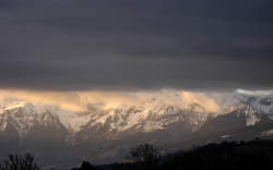
- Sunrise in Swiss mountains
Image with the class .right. The image page has to be designed too, don't forget it.
This is an image without a description and the class .left. I've used <br style="clear: both;" /> above to have a little space between the images. You can see it in the source code of this page.
And tables
| Some comments about tables | Possible solutions |
|---|---|
| Tables need air to breathe, don't squeeze the things together too much | padding for td/th |
| Ensure whether you really need the vertical bars |
